How to Change Chart Color in Google Sheets
Have you not added graphs in Google Sheets yet? Well, then you must as you can also change chart color in Google Sheets. Graphs and charts help in the proper representation of the data. It is a pictorial representation giving a clear idea about what the data stands for. But, for the same, color coding can also be an important factor. So, once you know how to make google sheets graphs or charts, go ahead with changing colors. You will also learn how and for what reasons you can change colors of charts in google sheets.
Change chart border color in Google Sheets
Change Chart Color in Google Sheets: 5 Steps
Step-1 Open Google Sheets Application: On your mobile device, search for the google sheets application. Its icon is a green colored paper having a little fold on the top-right corner. It even has white outlined cells over it. Cannot find it?
- Well, then go to the play store application and type in Google Sheets in the search bar.
- Look for the described icon of google sheets to appear and then install it.

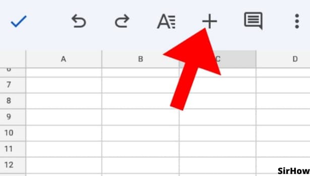
Step-2 The '+' Icon: On opening the google sheets application, you see different sheets. Select the one you want to work on to change chart color in google sheets.
- You can even work on a new spreadsheet or create a google sheet template.
- On opening the sheet, click on any cell. It is preferable to click on the cell that is around the data that you want to represent as a graph or chart.
- By clicking on a cell, formatting toolbars open up on the top and bottom of the screen.
- In the topmost toolbar, you will see a plus ion '+'.
- That is the insert option and from there you can go further.
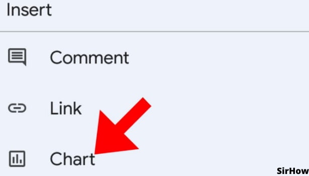
Step-3 Select Chart Option: By clicking on the plus sign, you see various things that can be inserted in google sheets. Those are comments, links, charts, images, rows, and columns.
- In order to change chart color in google sheets, select the option of charts.
- It will take you further to a demo chart screen from where other things can be edited.
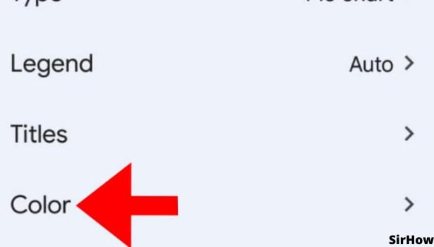
Step-4 Click on Color: On the next page after clicking on the chart, you see a demo screen where google sheets show how your chart will appear if inserted.
- The chart can be modified as per our needs.
- You can change the type of the chart, its legend, titles, and finally colors.
- Click on a color. It has a tiny arrow on its right end that looks like a greater than '>' sign.
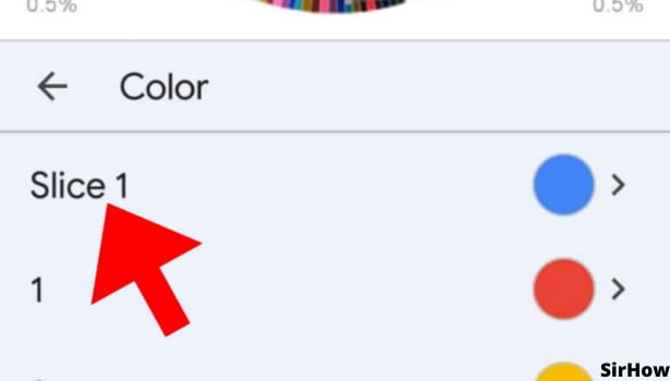
Step-5 Choose the Color: Finally, here you can select the color of your choice. If it's a bar graph or line chart or alike, you will see options of basic color and custom color. If it is a pie chart, you can choose to change the color of each slice.
Isn't it amazing how you just have to give google sheets orders and it will work for you? Now, you might be thinking that what is the use of changing colors. To clarify, each color has its own effect and meaning. The importance here is of giving an exact meaning to whoever sees our google sheets graph. Let me explain to you how.
- For instance, you have made a pie chart in google sheets for the budget.
- Now, using pink for income, yellow for expenditure, wouldn't make much sense.
- Instead, using green color for income, red color for expenditure, blue for investments, makes much better sense.
- This way, you don't have to worry about explaining what each section means, the viewers can easily come to know.
Thus, try changing colors as per their conventional/traditional/widely known meaning and see the difference in the impact of your google sheets.