How to Insert Column Chart in Google Sheets
Just like a pie chart, you can also insert a column chart in google sheets and revive the look and aesthetics of your sheet.
A column chart is a way of representing your data with the help of different columns. These columns are created and arranged in accordance with the values that they hold. They look a bit like line graphs. Oh, did we just tell you that you can also add line graphs to your Google sheet. There are a lot of things that you still need to know in order to master using Google sheets. But, let us start with learning how to insert column charts in google sheets in 7 easy steps.
Create a Column Chart in Google Sheets
Insert Column Chart in Google Sheets in 7 Steps
Step-1 Open Up Google sheets On Your Device: Just like you have done in any other Google sheets process, this one also starts with you opening up the Google sheets in order to add the column chart.
You can either create a new Google sheet or also open an existing one with the help of its link. For that,
- Go to your web browser.
- Then, paste the link to the Google sheet that you want to open.
- Search for it and the sheet will open up. Press the 'Enter' key to search for the sheet.

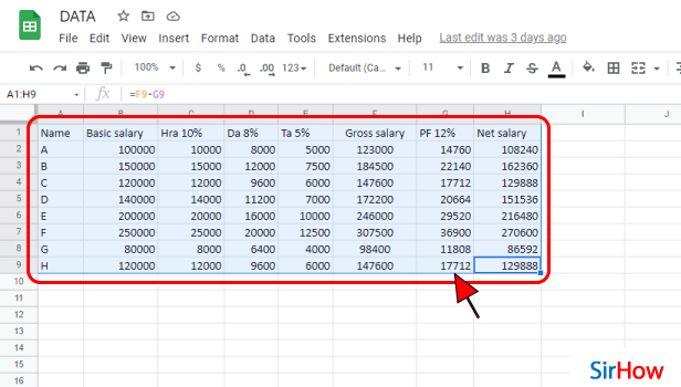
Step-2 Select The Data That You Want in Chart: We hope that you have your data ready in your spreadsheet.
But, even if your data is not entered yet, then:
- The first step is to type the mathematical data or information statistics that you want to include in your column chart.
- Then, select the data until it gets highlighted.
- You can also refer to the picture below to see what your sheet should look like when you select your data.
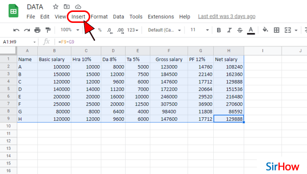
Step-3 Click On 'Insert': The top menu bar of the Google Sheets app/ website contains the following tabs:
- File
- View
- Insert
- Edit
- Format
- Data
- Tools, and others
From these tabs, you have to choose the 'Insert' tab.
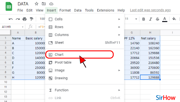
Step-4 Click on 'Chart': There are various sections in the list menu of the 'Insert' tab. But, you have to go to the second section with four options. These 4 options are as follows:
- Chart
- Pivot table
- Image
- Drawing
From the above-mentioned options, you have to choose the option which says ‘Chart’ because the column chart comes under this section only.
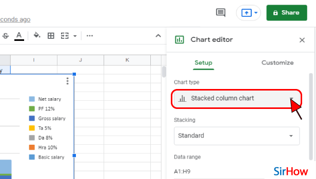
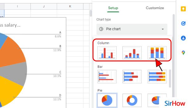
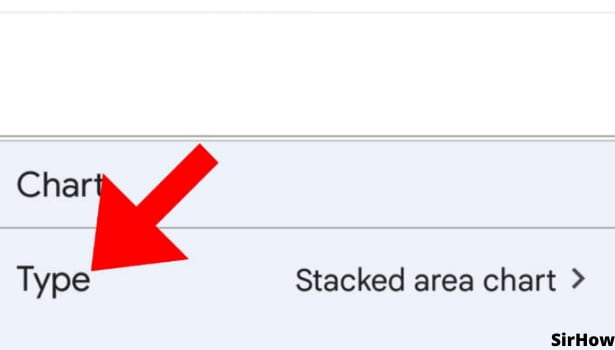
Step-5 Click Here as shown and Select Chart Type: In the chart type, the default option is the Stacked column chart. But, you have to choose the normal. column chart.
In order to choose the normal column chart, click on the area where it is written 'Stacked column chart' in the below picture.
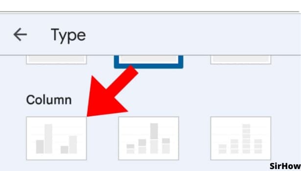
Step-6 Select Column chart That You Want: You will see various sections in the 'Chart type' section. These sections of charts are:
- Column
- Bar
- Pie
In order to insert a column chart, go to the 'Column action and choose the third type of chart.
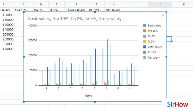
Step-7 Your Column Chart is Now Added: After all the hard work, you have now finally added the column chart of your choice to your Google sheet.
FAQ
How Can I Insert a Column Chart in Google Docs?
If you want to add a column chart to your document that you have prepared with the help of the Google docs application, then you first have to access that Google docs file, and after that do the following:
- To add a new chart to a document in Google Docs, first, point to the cursor where you want to add the chart.
- Then, simply move to the Insert menu.
- Tap on 'Chart'.
- Then, select the type of chart to use (e.g., bar, column, line, or pie). Here you can click on the 'Column' option to add the column chart.
Can I Create a Column And a line Chart in Google Sheets?
If you want to create a column chart and a line chart together in google sheets, then you can absolutely do that.
This thing comes under the 'Combo chart' feature of Google sheets. We have profoundly explained this with the help of the following steps:
- Open your spreadsheet.
- Then, make a decision on what data set will be used to create the chart.
- Then, simply select the data needed by clicking and dragging over the required portion of the data set.
- Click the 'Chart' button in the top right of the toolbar of the 'Insert' menu.
- Then, in the Chart type, you have to tap on the 'Combo Chart' option.
- From here, choose a column chart and a line chart.
How Can I Graph two Columns in Google Sheets?
When you graph two columns in google sheets, it flips the respective rows and columns. You can see how:
- First of all, you have to look for an empty space in the spreadsheet.
- Then, from there, select a cell in that area.
- In that cell, type out your data.
- Then, press 'Enter'.
- Highlight the data you want to include in your graph. Make sure to include the headings.
In this way, you can insert any chart into google sheets.
Another Method
Charts are graphic representations of our data. It is easy to insert column charts in google Sheets and it is far easier to understand them than a list of numbers. When you have a significant amount of data to evaluate in google sheets, you may easily put it into a column chart. If you're looking for trends or the largest portion of the entire, a chart will swiftly show you what you're looking for. The purpose of charts is to give meaning to your data.
In just a few simple steps, you can simply insert a column chart into your existing Google Sheets document.
Insert Column Chart in Google Sheets: 6 Steps
Step 1- Open Google Sheets: Open the Google Sheets program on your mobile device. Its symbol is a green piece of paper with a small fold in the upper right corner. Can't seem to locate it. So, go ahead and launch the Google Play Store app.
- Look for the described symbol by typing 'Google Sheets' into the search field.
- White outlined cells have also been drawn over the green paper. Install it and open it after you've found it.

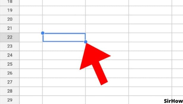
Step 2- Tap on any cell: After you have opened the google sheets application, and are on the particular spreadsheet you want to add the line graph to, select the cell you want to add the graph to. For selecting the cell, just navigate to that cell, and tap on it. A blue rectangle will surround that cell, indicating that the cell has been selected.
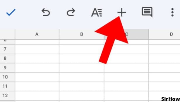
Step 3- Tap on + icon present on the top corner: After you select the cell you want to add the chart to, just tap on the + symbol that appears on the top corner of the interface. You may also tap on the "Insert" option depending on the version of google sheets you are using.
This will open a drop-down menu with many options like "comment", "Link", etc.
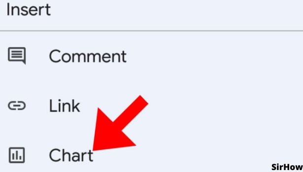
Step 4- Tap on chart: Hit on the "Chart" option in the drop-down menu. This will help make different types of graphs and charts and graphs, like line graphs, column charts, pie charts, etc in the sheets.
Charts make it easy to visualize the data and properly analyze it. Instead of going through a whole lot of numbers you can just observe the chart and make a fair judgment.
Step 5- Select your chart type: You may now choose which sort of chart you want to include in the document. The chart type you use is determined on the data set you're working with. You can insert a pie chart for relative comparisons and column charts for precise comparisons if you wish to compare values.
You can also use an area chart or a bubble chart to compare quantities. Use a line chart, bar chart, or scatter plot to demonstrate trends and patterns in your data.
Step 6- you can select any column chart: Column charts further have some different variations. For example, we have simple Column charts, Stacked Column charts, and 100% Stacked Column charts. Above all, select the charts depending on the data set.
Conclusion
In conclusion, column charts use vertical lines to show values. Column charts use vertical lines. They can help you understand the magnitude of the items they represent.
It's much easier to find meaning in a beautifully illustrated Column chart or bar graph than in a list of data. Certainly, a well-placed chart in your presentation can help you make your point clearer and help make everyone understand your data.
Insert Column Chart in Google Sheets in 7 Steps
Step-1 Open Up Google sheets On Your Device: Just like you have done in any other Google sheets process, this one also starts with you opening up the Google sheets in order to add the column chart.
You can either create a new Google sheet or also open an existing one with the help of its link. For that,
- Go to your web browser.
- Then, paste the link to the Google sheet that you want to open.
- Search for it and the sheet will open up. Press the 'Enter' key to search for the sheet.
Step-2 Select The Data That You Want in Chart: We hope that you have your data ready in your spreadsheet.
But, even if your data is not entered yet, then:
- The first step is to type the mathematical data or information statistics that you want to include in your column chart.
- Then, select the data until it gets highlighted.
- You can also refer to the picture below to see what your sheet should look like when you select your data.
Step-3 Click On 'Insert': The top menu bar of the Google Sheets app/ website contains the following tabs:
- File
- View
- Insert
- Edit
- Format
- Data
- Tools, and others
From these tabs, you have to choose the 'Insert' tab.
Step-4 Click on 'Chart': There are various sections in the list menu of the 'Insert' tab. But, you have to go to the second section with four options. These 4 options are as follows:
- Chart
- Pivot table
- Image
- Drawing
From the above-mentioned options, you have to choose the option which says ‘Chart’ because the column chart comes under this section only.
Step-5 Click Here as shown and Select Chart Type: In the chart type, the default option is the Stacked column chart. But, you have to choose the normal. column chart.
In order to choose the normal column chart, click on the area where it is written 'Stacked column chart' in the below picture.
Step-6 Select Column chart That You Want: You will see various sections in the 'Chart type' section. These sections of charts are:
- Column
- Bar
- Pie
In order to insert a column chart, go to the 'Column action and choose the third type of chart.
Step-7 Your Column Chart is Now Added: After all the hard work, you have now finally added the column chart of your choice to your Google sheet.
FAQ
How Can I Insert a Column Chart in Google Docs?
If you want to add a column chart to your document that you have prepared with the help of the Google docs application, then you first have to access that Google docs file, and after that do the following:
- To add a new chart to a document in Google Docs, first, point to the cursor where you want to add the chart.
- Then, simply move to the Insert menu.
- Tap on 'Chart'.
- Then, select the type of chart to use (e.g., bar, column, line, or pie). Here you can click on the 'Column' option to add the column chart.
Can I Create a Column And a line Chart in Google Sheets?
If you want to create a column chart and a line chart together in google sheets, then you can absolutely do that.
This thing comes under the 'Combo chart' feature of Google sheets. We have profoundly explained this with the help of the following steps:
- Open your spreadsheet.
- Then, make a decision on what data set will be used to create the chart.
- Then, simply select the data needed by clicking and dragging over the required portion of the data set.
- Click the 'Chart' button in the top right of the toolbar of the 'Insert' menu.
- Then, in the Chart type, you have to tap on the 'Combo Chart' option.
- From here, choose a column chart and a line chart.
How Can I Graph two Columns in Google Sheets?
When you graph two columns in google sheets, it flips the respective rows and columns. You can see how:
- First of all, you have to look for an empty space in the spreadsheet.
- Then, from there, select a cell in that area.
- In that cell, type out your data.
- Then, press 'Enter'.
- Highlight the data you want to include in your graph. Make sure to include the headings.
In this way, you can insert any chart into google sheets.
Another Method
Charts are graphic representations of our data. It is easy to insert column charts in google Sheets and it is far easier to understand them than a list of numbers. When you have a significant amount of data to evaluate in google sheets, you may easily put it into a column chart. If you're looking for trends or the largest portion of the entire, a chart will swiftly show you what you're looking for. The purpose of charts is to give meaning to your data.
In just a few simple steps, you can simply insert a column chart into your existing Google Sheets document.
Insert Column Chart in Google Sheets: 6 Steps
Step 1- Open Google Sheets: Open the Google Sheets program on your mobile device. Its symbol is a green piece of paper with a small fold in the upper right corner. Can't seem to locate it. So, go ahead and launch the Google Play Store app.
- Look for the described symbol by typing 'Google Sheets' into the search field.
- White outlined cells have also been drawn over the green paper. Install it and open it after you've found it.
Step 2- Tap on any cell: After you have opened the google sheets application, and are on the particular spreadsheet you want to add the line graph to, select the cell you want to add the graph to. For selecting the cell, just navigate to that cell, and tap on it. A blue rectangle will surround that cell, indicating that the cell has been selected.
Step 3- Tap on + icon present on the top corner: After you select the cell you want to add the chart to, just tap on the + symbol that appears on the top corner of the interface. You may also tap on the "Insert" option depending on the version of google sheets you are using.
This will open a drop-down menu with many options like "comment", "Link", etc.
Step 4- Tap on chart: Hit on the "Chart" option in the drop-down menu. This will help make different types of graphs and charts and graphs, like line graphs, column charts, pie charts, etc in the sheets.
Charts make it easy to visualize the data and properly analyze it. Instead of going through a whole lot of numbers you can just observe the chart and make a fair judgment.
Step 5- Select your chart type: You may now choose which sort of chart you want to include in the document. The chart type you use is determined on the data set you're working with. You can insert a pie chart for relative comparisons and column charts for precise comparisons if you wish to compare values.
You can also use an area chart or a bubble chart to compare quantities. Use a line chart, bar chart, or scatter plot to demonstrate trends and patterns in your data.
Step 6- you can select any column chart: Column charts further have some different variations. For example, we have simple Column charts, Stacked Column charts, and 100% Stacked Column charts. Above all, select the charts depending on the data set.
Conclusion
In conclusion, column charts use vertical lines to show values. Column charts use vertical lines. They can help you understand the magnitude of the items they represent.
It's much easier to find meaning in a beautifully illustrated Column chart or bar graph than in a list of data. Certainly, a well-placed chart in your presentation can help you make your point clearer and help make everyone understand your data.